Light, made
into product.

An independent design and software studio in Burnaby, BC. We design and build digital products and the brands around them, for ourselves and for clients.

Our own products.

We created all three, including the names and the brands. Each case shows the work behind it.

More design.

Identity, illustration, interfaces and print, for our own ideas and for clients.

What we do for clients.

We design your product and write its code, so the version you approve is the version that ships.

01

Product design & build

Websites, web apps and mobile apps. We design them, build them, put them online and keep them running.

Product design · Web apps · Mobile · AI features
02

Brand & identity

Names, logos, type, colour and illustration, plus a guide that keeps them consistent wherever they appear.

Naming · Identity · Illustration direction · Merch
03

Editorial systems

Magazines and newsletters, with the masthead, the typography and the publishing workflow behind them.

Editorial design · Email · CMS · AI-assisted workflows

You see the real product at every step, on your own screen.

  1. ResearchWe study your market, your users and your competitors, and agree with you on what the product has to do.
  2. DesignDirections come as working web pages, so you judge them at real size.
  3. BuildWe build what we design, so the details from the design make it into the product.
  4. Launch and supportWe put it live, watch how people use it and keep improving it.

The studio.

Based in Burnaby, BC. We work with clients wherever they are.

Artom Butenko

Creative director, partner

Ilarion Bohatyrov

Managing partner
← All work

Year of Stories

An illustrated story for children that runs for a whole year. A new episode comes out every Saturday, in English and French.

What we didConcept · Story world · Brand · Illustration direction · App design
Year2026–27
StatusLaunching January 2027
Visit—
Mira and the Spark

The brief

A small spark falls from the sky in January and needs a whole year to get home. The Frost is after him, and a girl named Mira keeps him warm with her lantern while the days get longer. Families read one episode every Saturday, at bedtime.

We wrote the world, drew the brand, set up how the paintings are made, and designed the weekly letter and the reading app. Every choice was checked against one question: will a child want to hear the next episode?

Story worldWordmark + Spark markPainted platesMap of the year64 iconsDesign systemiPhone + iPad appWeekly letter EN/FR

World

A map of the year.

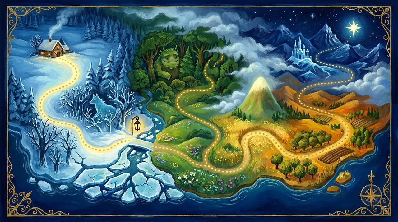
The story follows a road from a winter house to the star the Spark fell from. Each month covers one stretch of it, with a stop every Saturday. Every episode has its own painting, and all of them are made from the same character references, so the faces stay the same all year.

Map of the year
Map of the year. The painted map of the story, with the lantern road from the winter house to the star.
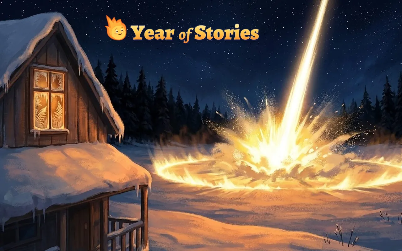
The night the star fell
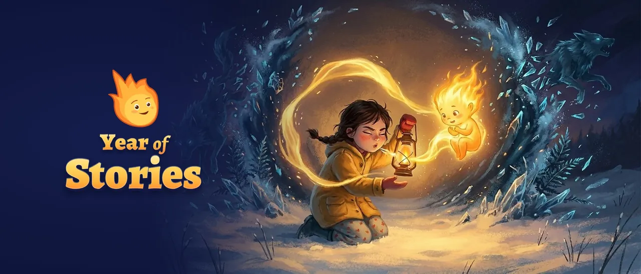
The night the star fell. The painting of the night the Spark falls into the field, with the logo set in the sky.
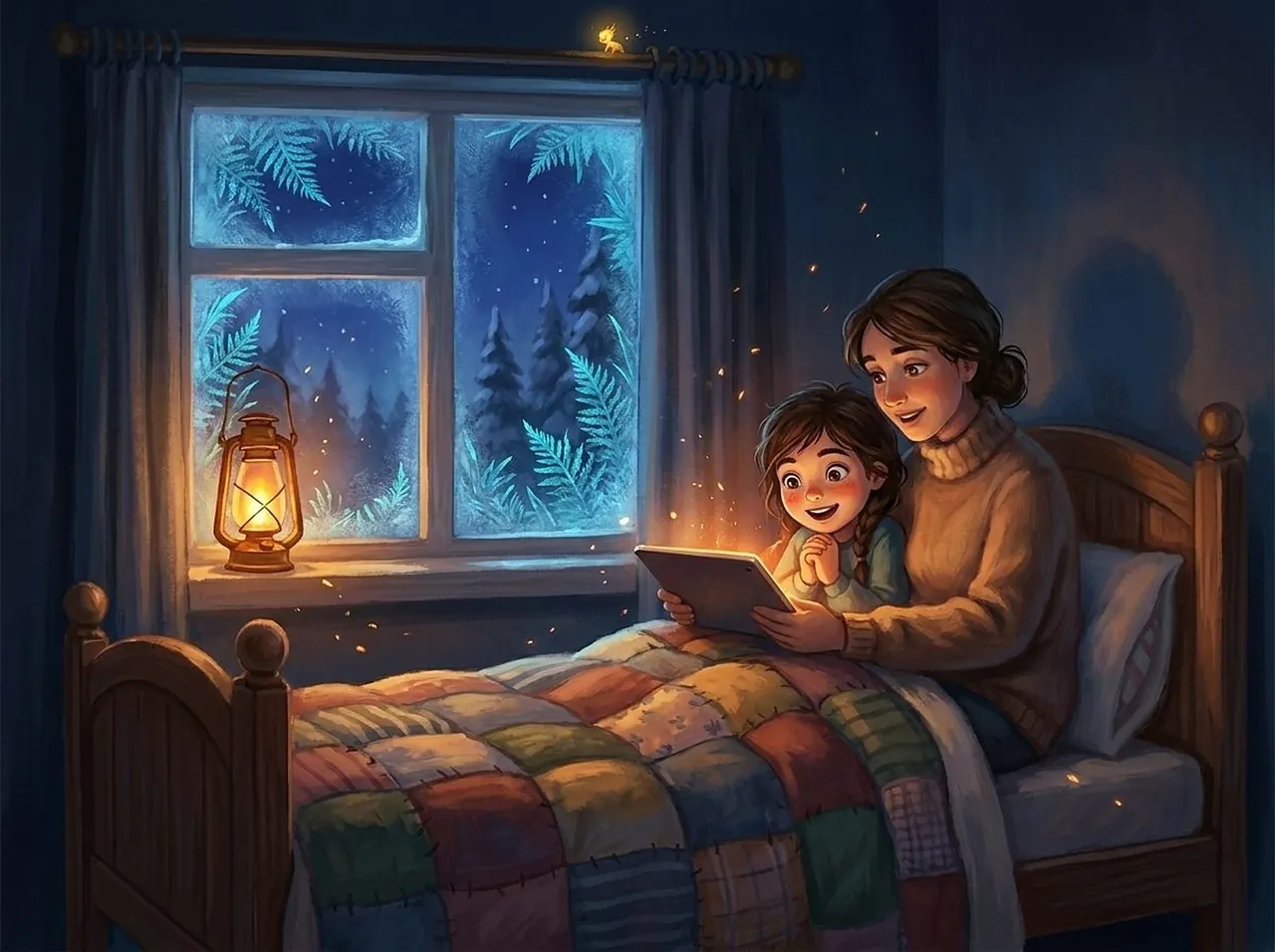
Bedtime
Bedtime. A parent and child reading the story by a frosted window.

Brand

The Spark.

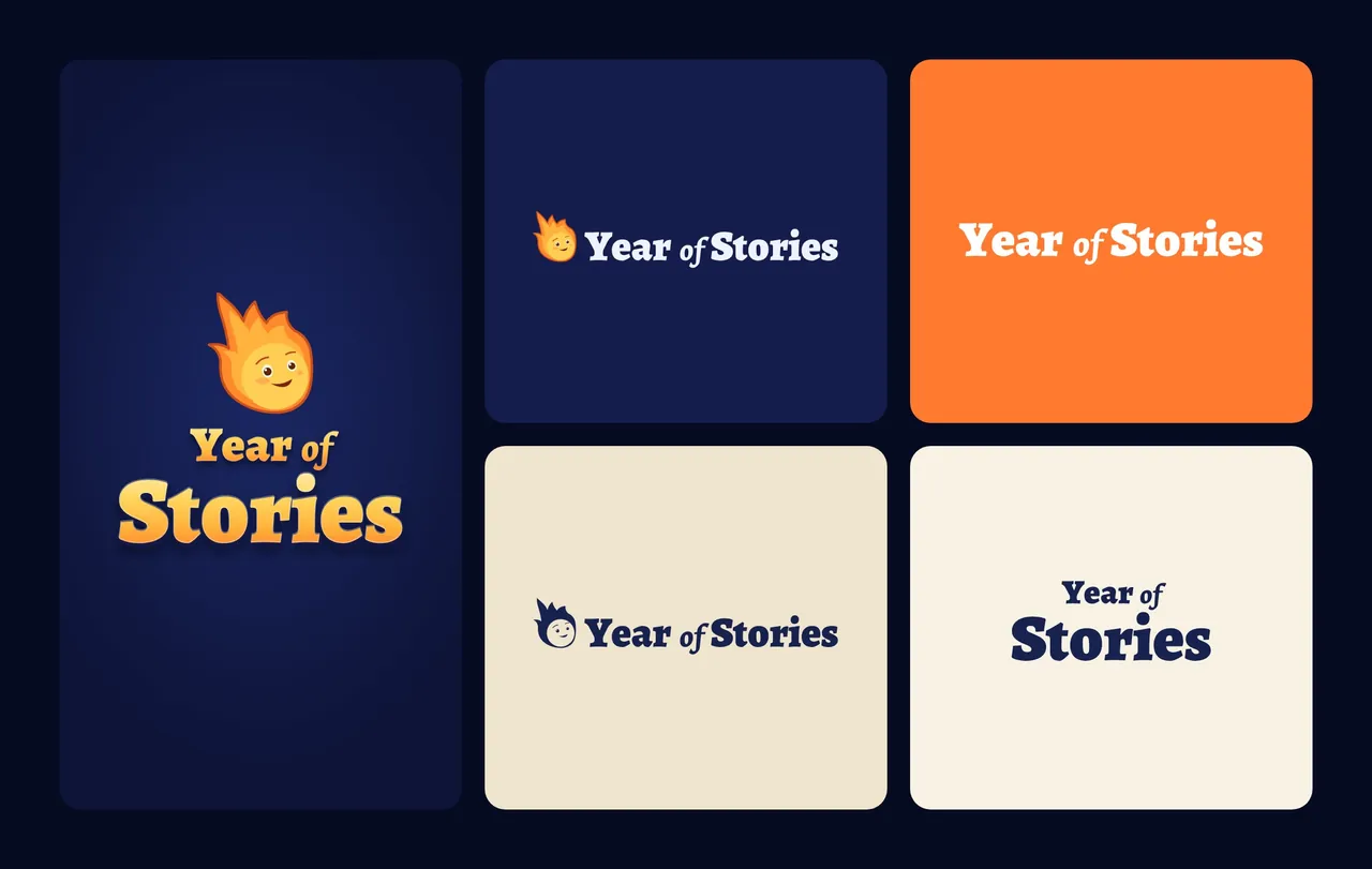
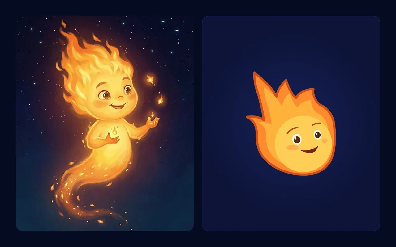
The wordmark is drawn from Alegreya, like a film title. The Spark mark was redrawn from the painted character and simplified until it still reads as an app icon. The colours are night blue, snow, gold and ember.

Logo versions
Logo versions. Stacked and horizontal versions in colour, in one colour and reversed, on night blue, ember and paper.
From painting to mark
From painting to mark. The Spark mark was redrawn from the painted character, keeping the tilt of the head and the expression.
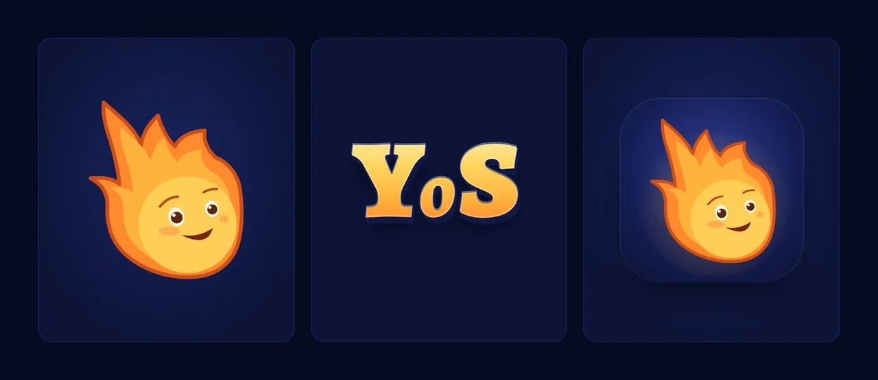
Mark, monogram, app icon
Mark, monogram, app icon. The Spark, the YoS monogram and the app icon, drawn as one family.

System

Design system.

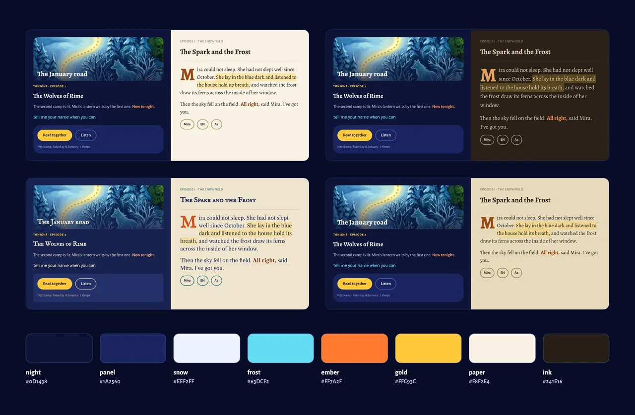
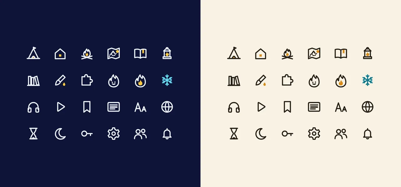
Colours for four reading modes: painted day, painted evening, engraving and dim paper. Every text colour is checked for contrast against its background. The 64 icons are all objects from the story, like a tent for Tonight and a lantern for Listen.

Four reading modes
Four reading modes. The same screen in painted day, painted evening, engraving and dim paper, with the core colours.
Icons
Icons. Twenty-four of the 64 icons, on night and on paper. Each one is an object from the story.
Components
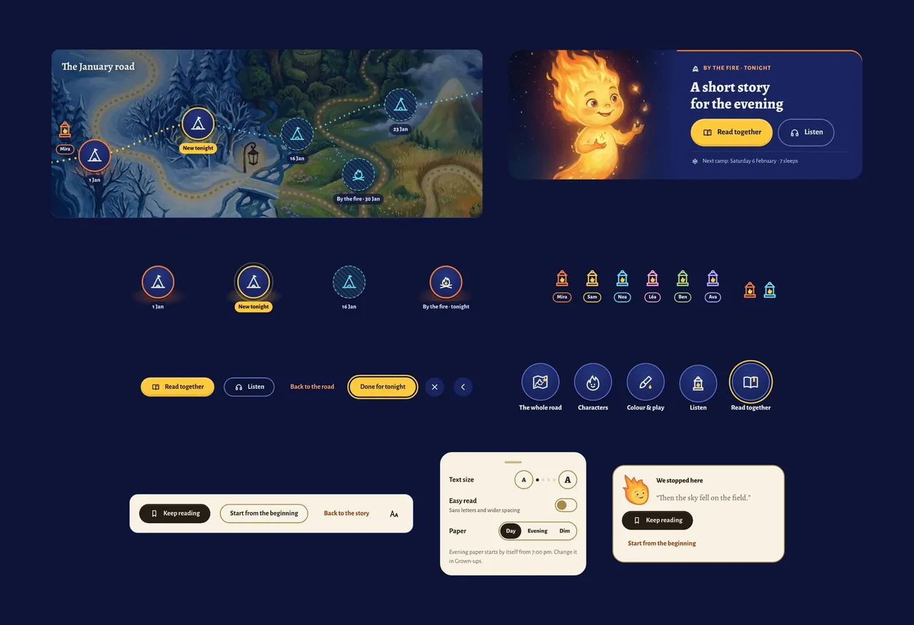
Components. The January road with its stops, the Tonight card, buttons and the reading settings.

Product

The app.

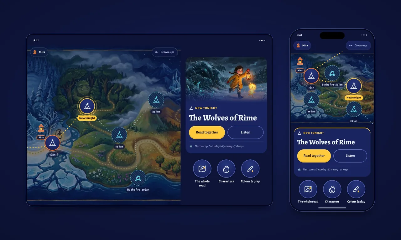
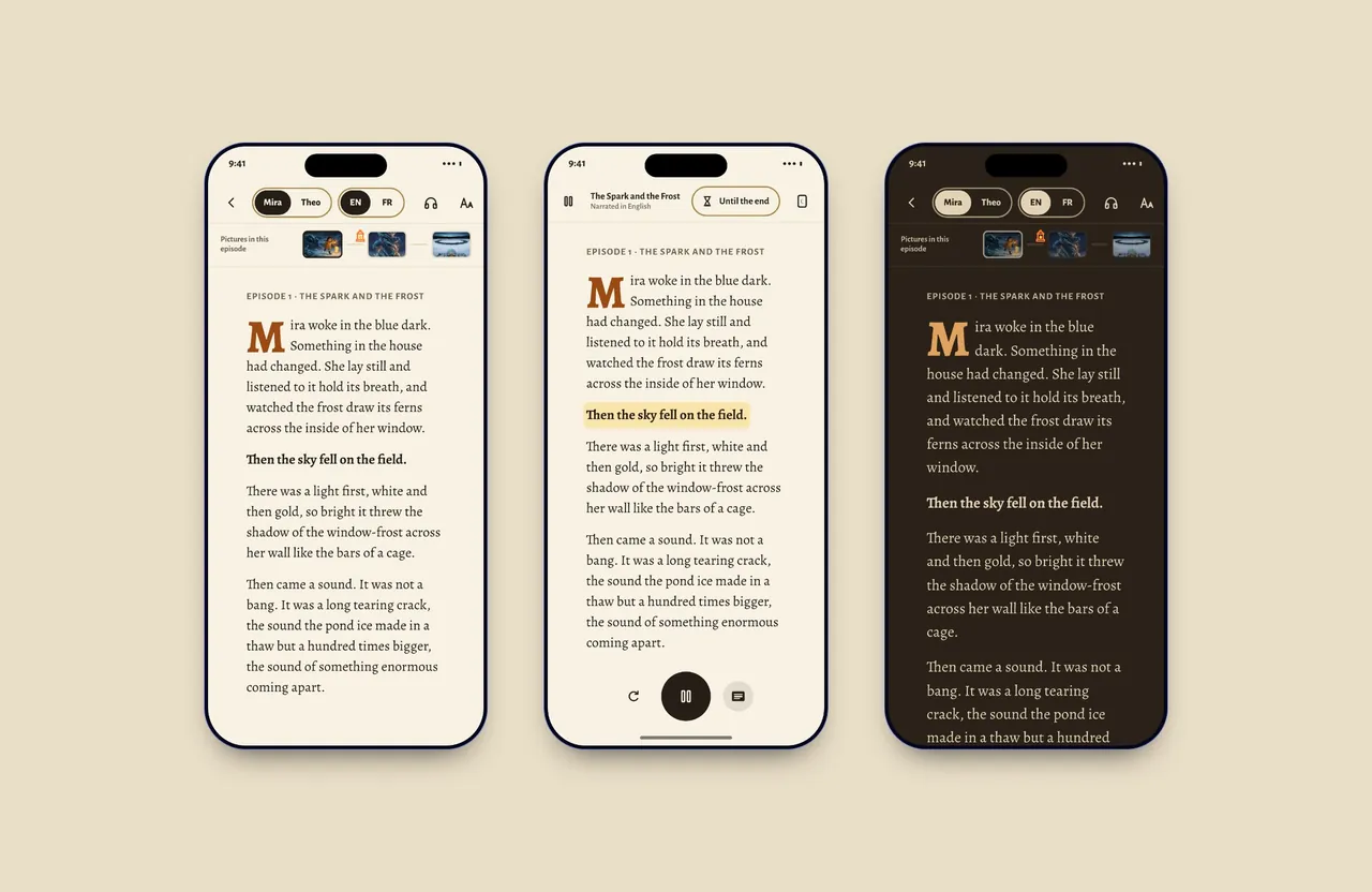
Designed for iPhone and iPad, for the end of the day. It opens on tonight's stop on the month's road. The reader plays narration with the words highlighted and has a warm evening paper. Parents' settings sit behind a door that takes a grown-up to open.

Tonight
Tonight. The home screen on iPad and iPhone: this month’s road, tonight’s episode and three things for children to tap.
Reading
Reading. The reader in day paper, with narration and the spoken line highlighted, and in evening paper.
End of an episode
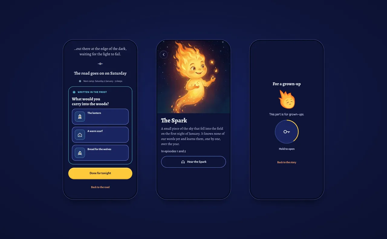
End of an episode. The last screen of an episode with a question written in the frost, the Spark’s character card and the door to the grown-ups’ settings.

Launch

A letter every Saturday.

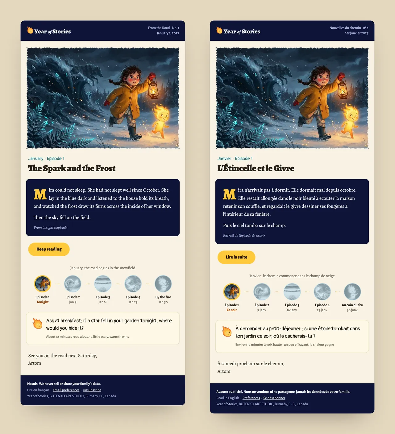
From the Road goes out with each episode, in English and French. It has the episode's painting, its first lines, how far along the month's road the story is, and one question for the family to talk about.

From the Road
From the Road. The first weekly letter in English and French, with the opening of the episode, where the month has got to and a question for the family.
Welcome letter
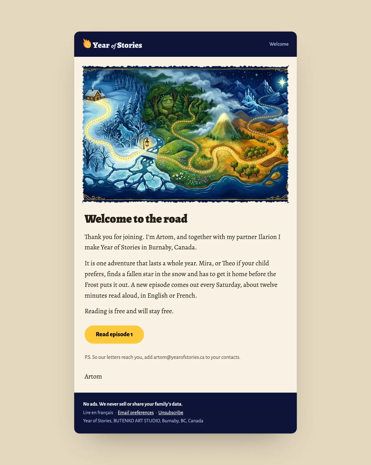
Welcome letter. The first email a family gets, with a link straight to episode one.
Next case · Editorial system8 Pages Burnaby
→